I respect your privacy. Unsubscribe at any time.
Accessibility is a key component of building web applications. Prioritizing accessibility benefits everyone—both people with disabilities and able-bodied individuals—by creating a more efficient, usable and inclusive experience for all.
If you're new to accessibility, I recommend starting with my previous article in this series - Testing Accessibility with the Keyboard, where I covered how to build keyboard-accessible web applications. Incorporating keyboard accessibility improves web accessibility significantly. However, it is only the first step.
This guide draws on my experience working on the accessibility team at Slack, to develop web applications that meet accessibility standards. Here, I’ll outline how screen readers work, share practical testing workflows, and provide tips for making your applications more accessible.
How do users use screen readers?
Screen readers are vital assistive technologies used primarily by people with low vision or complete blindness to navigate websites. Screen readers offer a range of navigation modes, such as quickly jumping between headings, links, or landmarks which significantly improves the browsing experience for users. They enable users to:
- Navigate content sequentially or by specific elements (e.g., headings, links).
- Understand the role, name, and state of interactive elements.
- Use keyboard shortcuts for efficient browsing.
Here’s a video of a visually impaired person using a screen reader to demonstrate how users use screen readers.
Some screen readers that are commonly used are -
Testing with only one screen reader is not sufficient for accessibility testing. Each has its own quirks, so it’s important to test with multiple screen readers.
Screen reader modes
In order to make navigation and reading easier, screen readers provide two modes of navigation - browse mode and focus/application mode.
- Browse mode:
- Used for navigating and reading the page
- Supports navigating by headings, links, and regions and provides keyboard shortcuts to facilitate navigation
- Ideal for exploring pages with a lot of static content
- Focus/Application mode:
- Engages directly with interactive elements like forms or modals
- Disables shortcuts for moving between elements
- Helpful when interacting with an application with lots of interactive and dynamic elements.
Technical overview of how screen readers work
Screen readers navigate the UI from top to bottom, providing users with enough information to understand and interact with the content on the page by leveraging the accessibility tree.
What is the accessibility tree?
The accessibility tree is a simplified, structured representation of the Document Object Model (DOM) that assistive technologies, like screen readers, use to interpret the UI. While it originates from the DOM, it is not a 1:1 copy of the DOM tree. Instead, the browser refines the DOM tree into a format that omits unnecessary or purely decorative information, focusing on content that is meaningful and interactive.
For instance, visual elements like decorative images or icons with no functional purpose are excluded from the accessibility tree. Therefore, the accessibility tree is similar to the DOM tree but with less information. The goal is to provide just enough context about each node without excessive verbosity, making navigation intuitive and efficient.
Here’s a representation of what the accessibility tree looks like -
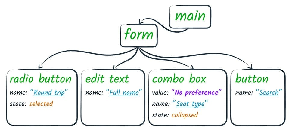 Source: https://web.dev/articles/the-accessibility-tree
Assistive technologies, including screen readers, switch devices, and braille displays, depend on the accessibility tree—not the DOM—to understand and present the content of a web page. A well-structured accessibility tree ensures that users with disabilities can effectively interact with applications.
To view the accessibility tree in browser developer tools:
- Chrome:
-
Open DevTools → "Elements" tab → "Accessibility" pane
-
Check “Enable full-page accessibility tree”
-
Click on the man icon

-
- Firefox:
- Right click on a page → Inspect Accessibility Properties
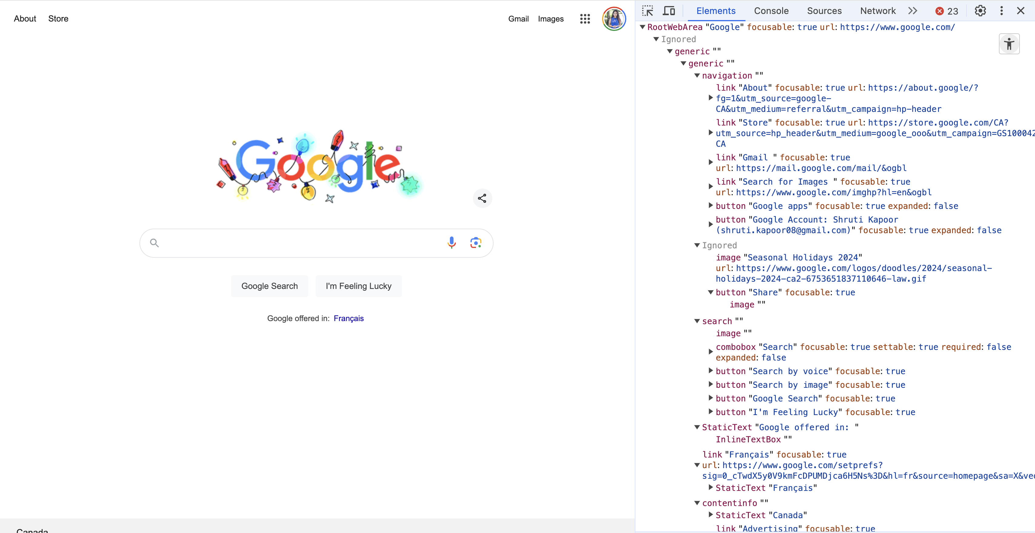 The accessibility tree when viewed on Google.com in Google Chrome
How Screen Readers use the accessibility tree
The browser generates the accessibility tree by combining the DOM, CSS, and ARIA attributes. It then creates platform-specific accessibility APIs (e.g., macOS Accessibility API, Android Accessibility Framework), etc. , which assistive technologies use to retrieve and convey content.
In order to convey complete information to the user, a screen reader needs the following information from the accessibility tree -
- Role: Defines the element's type (e.g., “button”, “heading”, “link”).
- Name: Specifies the element's accessible label or text content (e.g., button text or
aria-label). - State: Shows the element's current condition (e.g., “checked", “expanded", “disabled”).
- Properties: Provides additional attributes, such as whether an element is required or hidden.
- Hierarchy: Shows parent-child relationships to help screen readers understand content structure and flow.
For example, a button such as:
<button>Submit</button>
would appear in the accessibility tree as:
- Role: Button
- Name: Submit
- State: Default (not pressed)
Why is there no
aria-labelandroleadded to button here? Since<button>is a semantic element, its role and label are automatically derived, making additional attributes likearia-labelredundant.
A screen reader announces a DOM element in the following format -
[text label], [element type], [state]
Therefore, this button would be announced as -
“Submit, button”
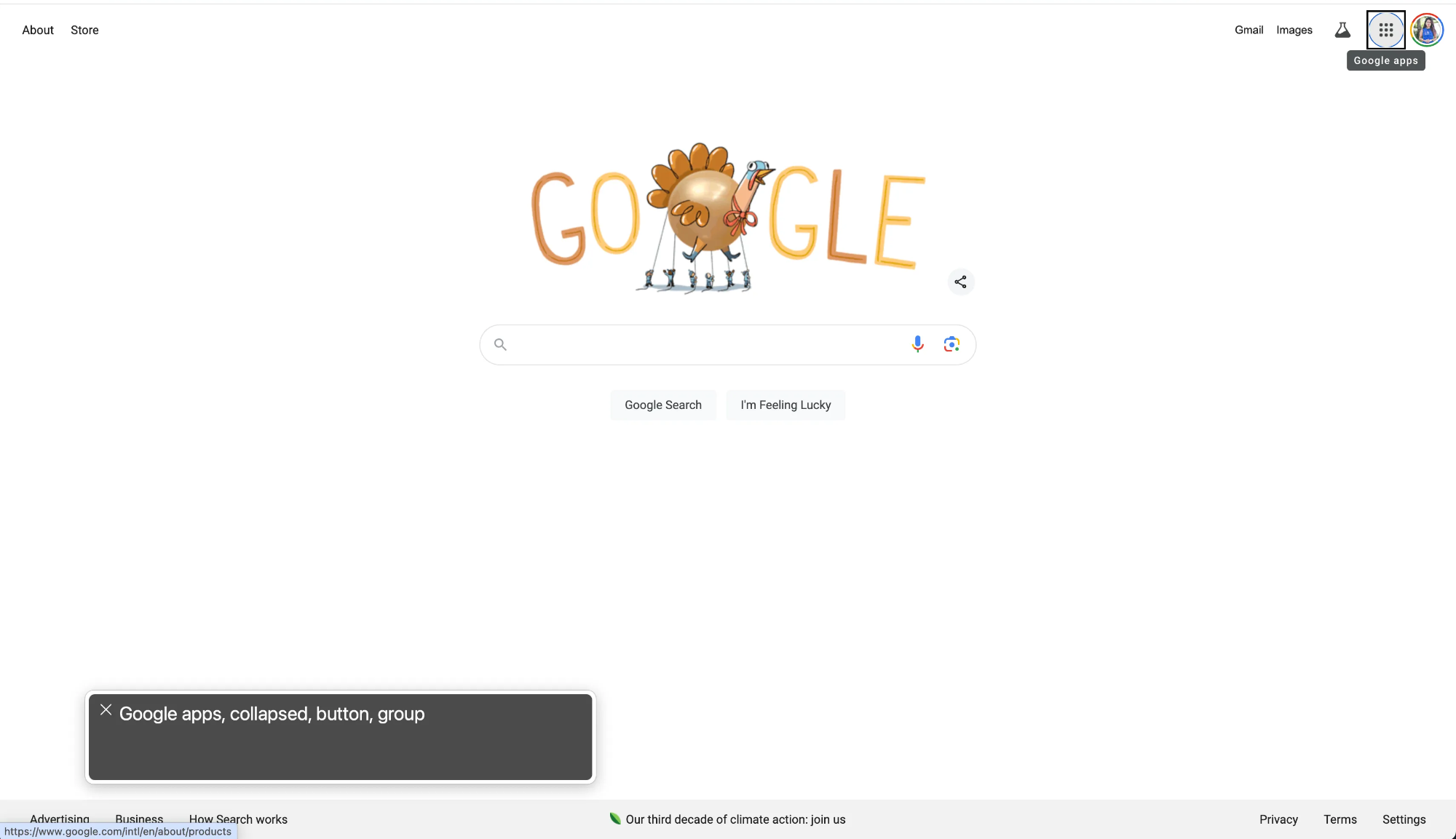 On the Google homepage, the “Google apps” button in its collapsed state is announced as: “Google apps, collapsed, button, group.”
Testing web applications with screen readers
To test with screen reader, you can first enable the screen reader on your computer and test your application by navigating via the keyboard and listening to the announcements of the screen reader.
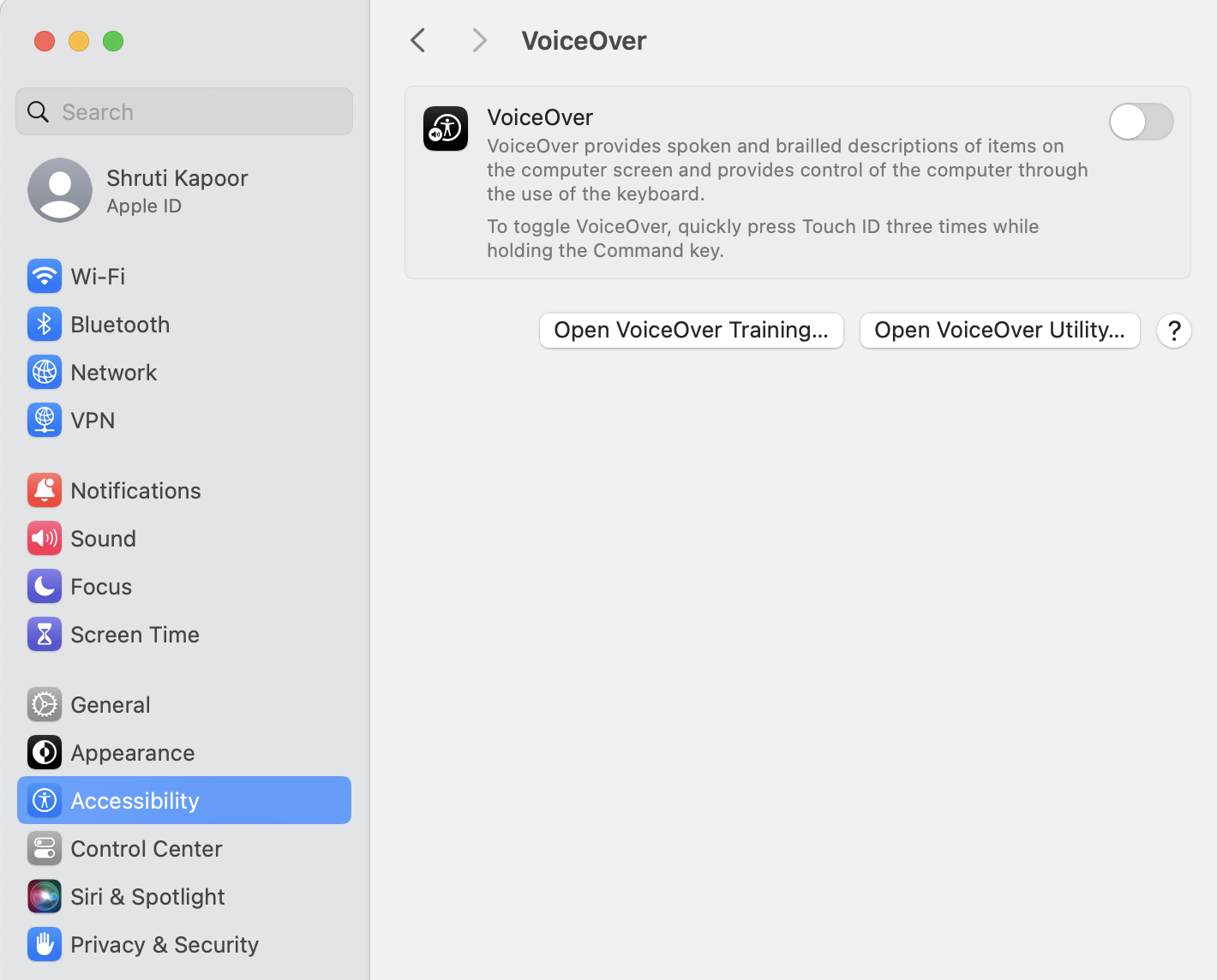
Enabling VoiceOver
- Go to Settings → Accessibility → VoiceOver.
- Toggle VoiceOver to turn it on
- Navigate the site while listening to the announcements of the screen reader to understand if you have the full context of the application state.
Testing workflow
-
Keyboard navigation:
- Tab key: Use
tabkey to navigate through the interactive elements of the app and useShift + Tabto go backwards. - Ensure that you can navigate to each interactive element on the page.
- Tab key: Use
-
Navigating headings, buttons and links: In MacOS, you can use the VoiceOver rotor to directly access headings, links or main items. To navigate using rotor -
- Open rotor using VoiceOver modifier keys (Ctrl + Option) + U
- Use the rotor feature to navigate by headings, links, or form elements.
- Verify that headings and links convey the full context of the intended action.
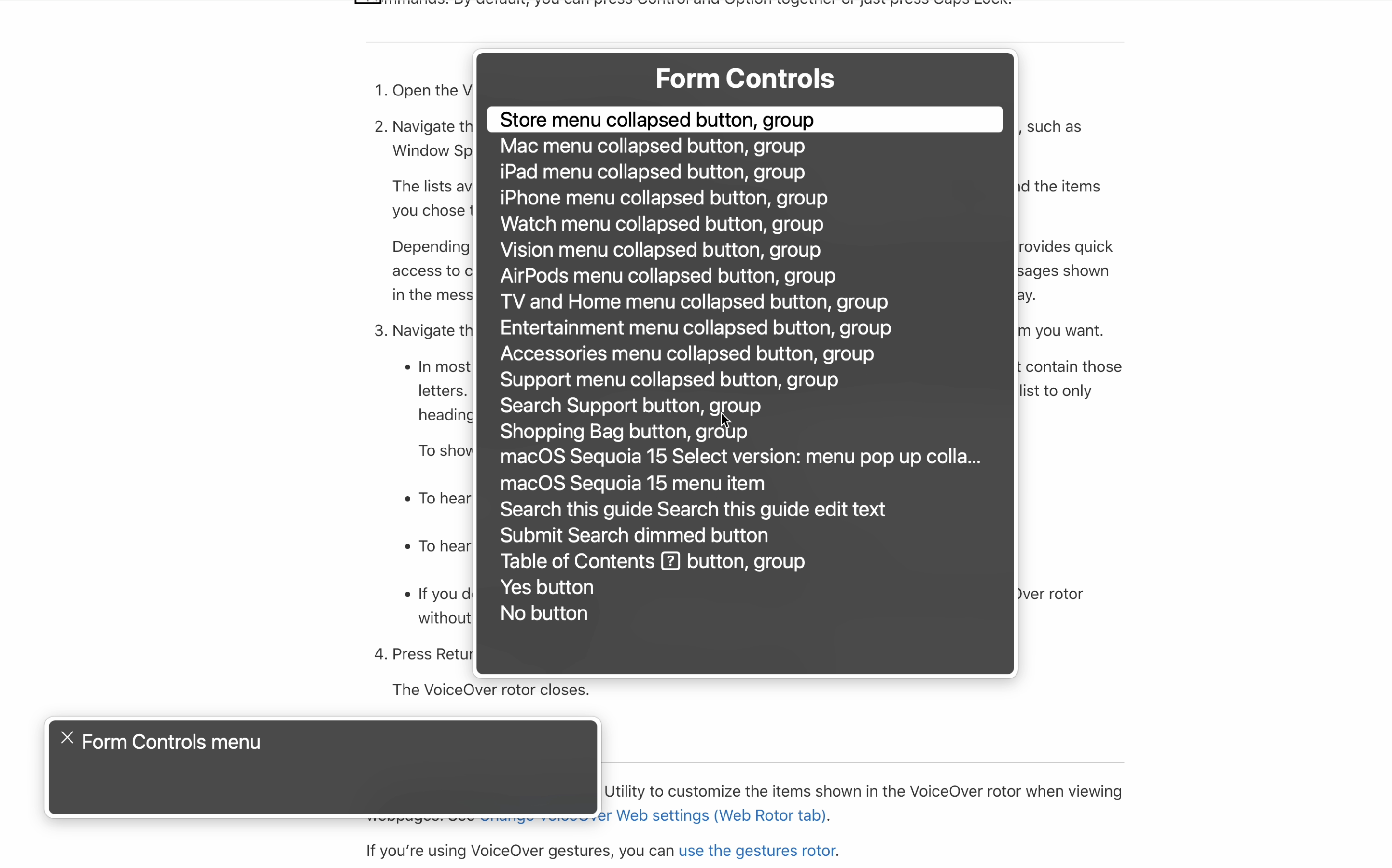 VoiceOver rotor
Other screen readers such as, JAWS and NVDA have similar features that display an elements list to allow users to quickly navigate between headings, links, lists, buttons, and more.
-
Application keyboard shortcuts: Some applications, such as Slack, VSCode, provide their own keyboard shortcuts when navigating with assistive technologies in order to provide a better experience. When testing with screen reader, ensure you are able to use these shortcuts and have full context on where the focus is at.
Key Testing Areas
When testing with screen reader, it is helpful to consider how a user perceives the web page through the screen reader. Here’s an example of a user using a screen reader but having difficulty perceiving the meaning of the content due to poor accessibility development.
Watch a Screen Reader Demo for Digital Accessibility Video
When testing with a screen reader, here are a few things to pay attention to -
- Focus management:
- Ensure that when navigating with screen reader, focus is always known. It should be clear which element is focussed.
- Focus should move in a logical manner and should not haphazardly jump from one section to another.
- Manage focus appropriately and programmatically when needed, especially for modals, dialogues, or dynamic content, so users know where they are on the page.
- Return focus to a logical location after closing modals or completing actions.
- Label and role announcements: When navigating between components, ensure that elements are announced with their correct role and have a defined label. Here is a list of roles defined for HTML elements.
- Updates and notifications are announced: If there are urgent notifications delivered to the user, these notifications must be announced. An example is a user receiving a new message in Slack while browsing message history in Slack. This type of content, called dynamic content, is denoted by
aria-live.
<div aria-live="polite"><p> You have received 1 new message </p> </div>
- Alt Text for Images: Ensure all images have descriptive
alttext to convey their purpose or content. For purely decorative images, use an emptyaltattribute (alt="") to hide them from screen readers. For images that are useful for the screen reader to know, it is important that the alt text gives enough context to the screen reader about the image. For example -
<img src="team-photo.jpg" alt="Team photo of employees at the company retreat" />
- Descriptive link labels: Links should provide clear context about their destination or purpose. Avoid vague labels like "click here" or "read more." Instead, use descriptive text.
<a href="/pricing">Click here</a> // Bad example<a href="/pricing">View our pricing plans</a> // Good example
- Forms navigation:
- When navigating in a form, ensure that all fields are traversable and are announced with their proper label and type.
- Any errors, validation messages or form submission notifications must be announced.
- When multiple fields have errors, programmatically move focus to the first error field.
- Each form field must have a programmatically associated label.
- Provide clear error messages using
aria-describedbyfor accessible feedback.
<label htmlFor="email">Email Address:</label><input id="email" type="email" aria-describedby="email-help" /><span id="email-help" className="error-message">Please enter a valid email.</span>
- Clear Landmarks:
Use landmarks to provide structure and improve navigation. Screen readers allow users to jump between landmarks quickly through shortcuts, therefore providing landmarks enables efficient navigation.
<header> <h1>Welcome to my Blog</h1></header><nav> <ul> <li><a href="/about">About Me</a></li> <li><a href="/contact">Contact</a></li> <li><a href="/blog">Blog</a></li> </ul></nav><main> <p>Main content goes here.</p></main>
Note that some landmarks should only appear on the page once - e.g.,
<h1>,<head>,<main>, etc.
Tips for ensuring a screen reader accessible site
-
Keyboard-First Navigation: Interactions must be fully usable without a mouse, therefore prioritizing keyboard accessibility helps build a better experience for users of all abilities.
-
Design with Accessibility in mind. Involve accessibility early. It is much easier to build an accessible app from the beginning instead of slapping it in later. Designing with accessibility in mind from the start helps to avoid retroactive fixes which can be extremely expensive.
-
Avoid Visual-Only Cues
- Ensure important content is not conveyed solely through color, icons, or visual effects.
- Provide text alternatives or other cues (e.g.,
aria-hiddenattributes for icons with text labels).
-
Specify the
langattribute: Explicitly setting thelangattribute on the<html>tag ensures screen readers and other assistive technologies interpret the page's content in the correct language.<!DOCTYPE html><html lang="en"><head><title>Welcome Page</title></head><body><h1>Welcome to My Blog </h1></body></html> -
Use semantic HTML: Using semantic HTML to convey the information of a block of element helps screen readers and assistive technologies. Overusing
<div>and<span>elements, which have no semantic value, can cause screen readers to announce all of the content as a single block of text. However, remember to use semantic element for its appropriate functionality. Using an incorrect semantic tag can cause confusion and misrepresentation of UI elements. -
Avoid using abbreviations. Screen reader may not have context on abbreviations. If a screen reader encounters an abbreviation such as “CDC", it may not understand it and may pronounce it phonetically—which might sound like a jumble of consonants. To provide context, you can spell out the abbreviation, such as
<abbr title="Centers for Disease Control and Prevention">CDC</abbr>. If the abbreviation is well-known — you might reverse this order, such as: HTML (HyperText Markup Language). -
Exercise caution when using
aria-hidden.- Never use
aria-hiddenon focusable elements. This might prevent users from perceiving important controls. - Only hide content with ARIA when doing so will improve the user experience. For example, if an icon has an appropriate accessible name, you may hide the icon character, which would prevent screen readers from announcing the icon along with the accessible name.
- Never use
-
Content organization: Since a person using a screen reader might jump around your page looking for important information such as headings, bulleted lists, and links, it is helpful to organize content in a logical manner. Some tips to organize content are -
- Use ordered and unordered lists to break up longer content
- Use descriptive headings to organize ideas.
- Use headings in order.
- Keep page layout consistent
-
Automated Testing: Using an automated tool can help to highlight issues with semantic HTML, missing alt tags, inconsistent headings, etc. Use tools like:
-
Axe DevTools
-
Lighthouse
-
WAVE
However, don’t rely solely on automated tools. Testing with real screen reader users is crucial for understanding the app’s user experience and identifying pain points that automated tools cannot highlight. Make sure to include real user testing in your process.
Conclusion
Testing with screen reader is an important part for ensuring accessible web apps. However, it is important to not rely on only one screen reader for testing. Different screen readers have different capabilities, and people use them in different ways. By ensuring that your app functions well with screen readers, we enable the web apps to be accessed by people with disabilities and people who are able bodied.
Remember, web accessibility isn’t just about screen readers. To learn out how to make web apps accessible, join my talk at Epic Conf

